Monday, June 11, 2012
WA calendar
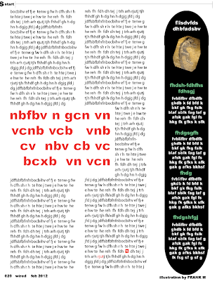
In this piece i was trying to show that at the academy time flies. This was shown by the calendar pages piling up in background.
The most important element of design would be shape because it is mostly shapes in this piece and the shapes are related to the school.
The focal point is the academy building and the words "woodstock academy". you are lead to see that because they are towards the middle and stand out from the rest of it.
Tuesday, May 29, 2012
Wednesday, May 23, 2012
Wednesday, May 16, 2012
Tuesday, May 15, 2012
Wednesday, May 2, 2012
emotions book
the theme is emotions.
the reader will be lead through by the opposite emotions.
best part so far is the happy page.
the reader will be lead through by the opposite emotions.
best part so far is the happy page.
Thursday, April 26, 2012
Wednesday, April 25, 2012
animation final
The theme to my animation was metamorphosis. What i did is i have a unknown object transforming into a bird that then flies away, then it fades out and the words "THE END" drop down and the E falls off.
Some techniques that worked well are tweening and panning.
A discovery i made while making the movie is that tweening makes the frames transition much smoother.
Some techniques that worked well are tweening and panning.
A discovery i made while making the movie is that tweening makes the frames transition much smoother.
Thursday, April 12, 2012
Wednesday, April 4, 2012
Sleep
Sleep
My theme was sleep and I thought of a bed and words that have to do with sleep and dreams.
I used used a font that is light and flows, I also used a calm color on the words. I started by thinking of words that have to do with sleep. I used words like free, careless, and uncaged to show sleep and dreaming. A discovery that I made is that using crinkled paper in a scanner can get different effects than just making a image on a computer as you can see in the lower half of my image.
Wednesday, March 28, 2012
Daniel Danger
this is not my art... just art i like.
This image "the elk guard" is by Daniel Danger. It is a detailed image with a elk over looking the area.
Paper Folding Design
Paper Folding Design
My theme was opposites. I achieved this by using hot and cold colors and literally using hot and cold pictures. If you look at it from bottom you see the red fire. If you look at it from the top you see the blue water. if you look at it from the top you see both and it reveals a quote by Andy Warhol reading "The most exciting attractions are between two opposites that never meet".
My theme was opposites. I achieved this by using hot and cold colors and literally using hot and cold pictures. If you look at it from bottom you see the red fire. If you look at it from the top you see the blue water. if you look at it from the top you see both and it reveals a quote by Andy Warhol reading "The most exciting attractions are between two opposites that never meet".
BOTTOM
TOP
ABOVE
Friday, March 16, 2012
Subscribe to:
Comments (Atom)


